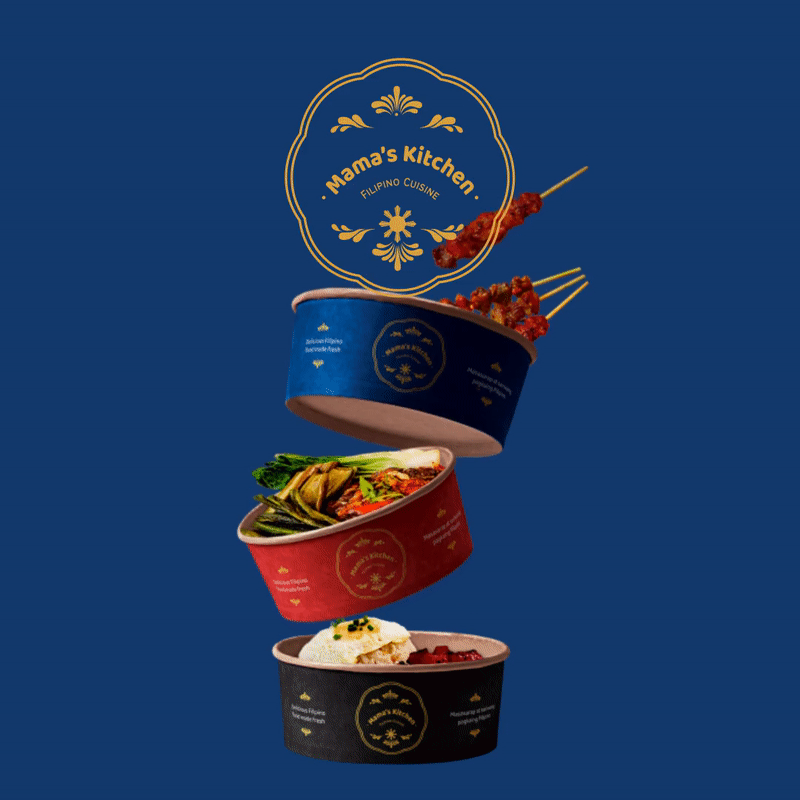
MAMA'S KITCHEN
#THEBRIEFASSOCIATION
BRIEF
‘Introducing Mamas Kitchen! The next best thing to happen! Serving a mouthwatering journey through the vibrant world of South East Asian cuisine!'
LOGO & BRANDING, DESIGN, ART DIRECTION, ANIMATION, PRINT & PACKAGING.
#THEBRIEFASSOCIATION
BRIEF
‘Introducing Mamas Kitchen! The next best thing to happen! Serving a mouthwatering journey through the vibrant world of South East Asian cuisine!'
LOGO & BRANDING, DESIGN, ART DIRECTION, ANIMATION, PRINT & PACKAGING.
PROCESS
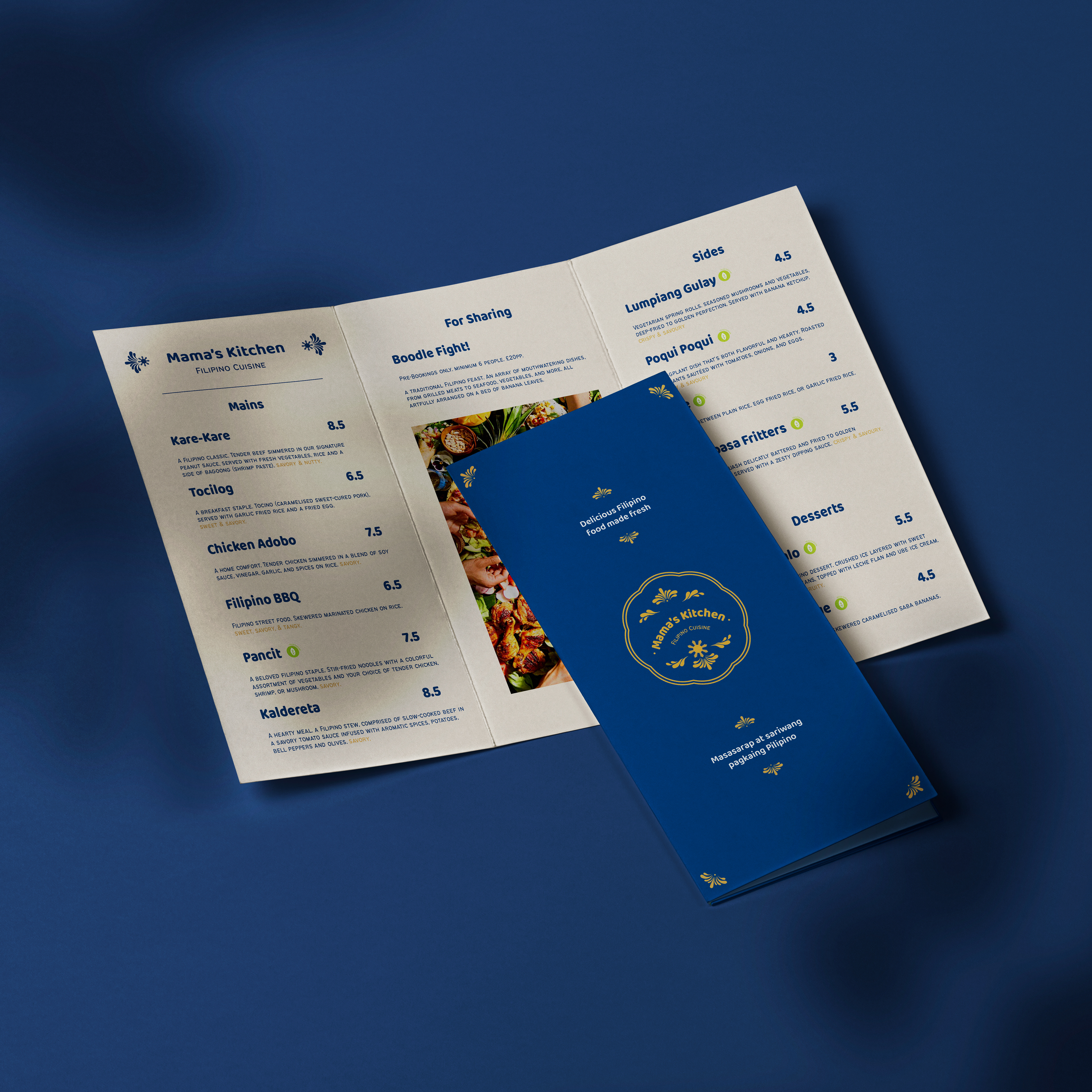
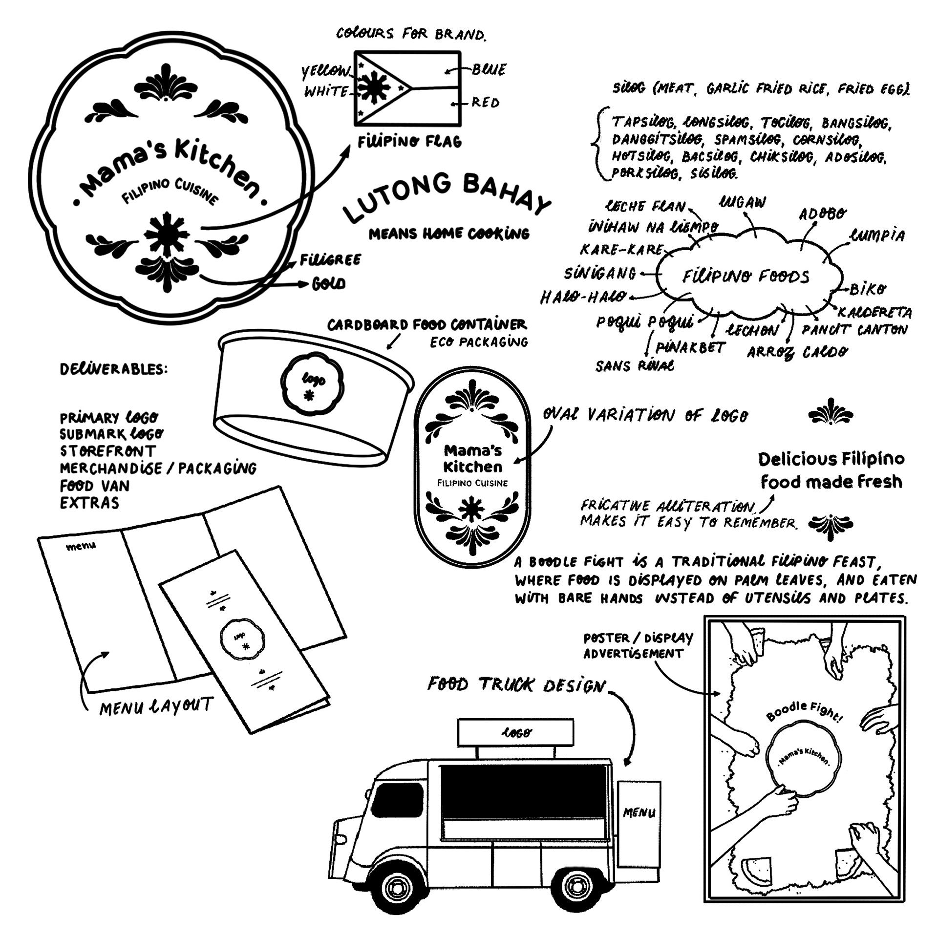
Being half-Filipino, I feel deeply connected to the Philippines and its culture. Food is a powerful medium for preserving and sharing cultural heritage, and in this project, I wanted to celebrate those home comforts.
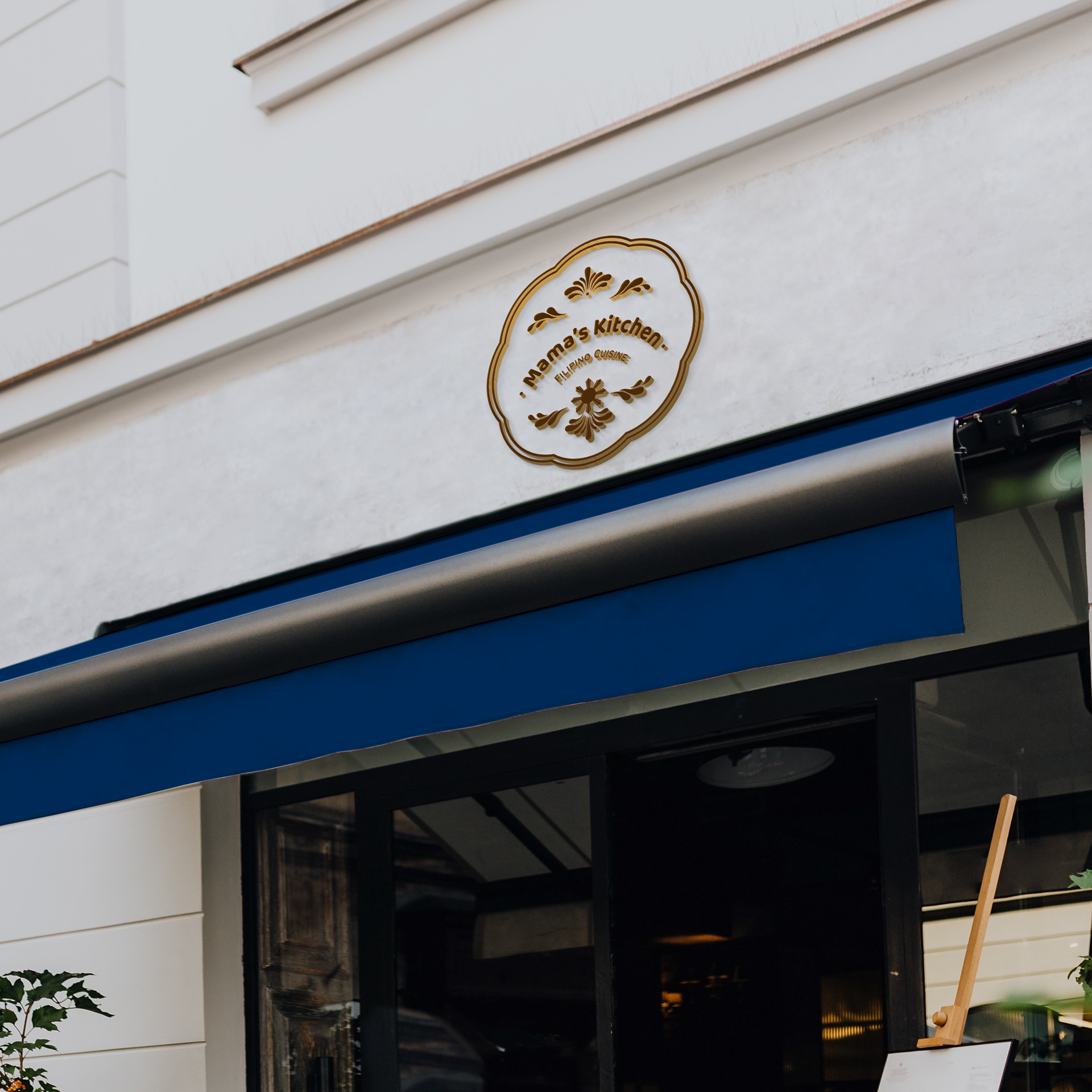
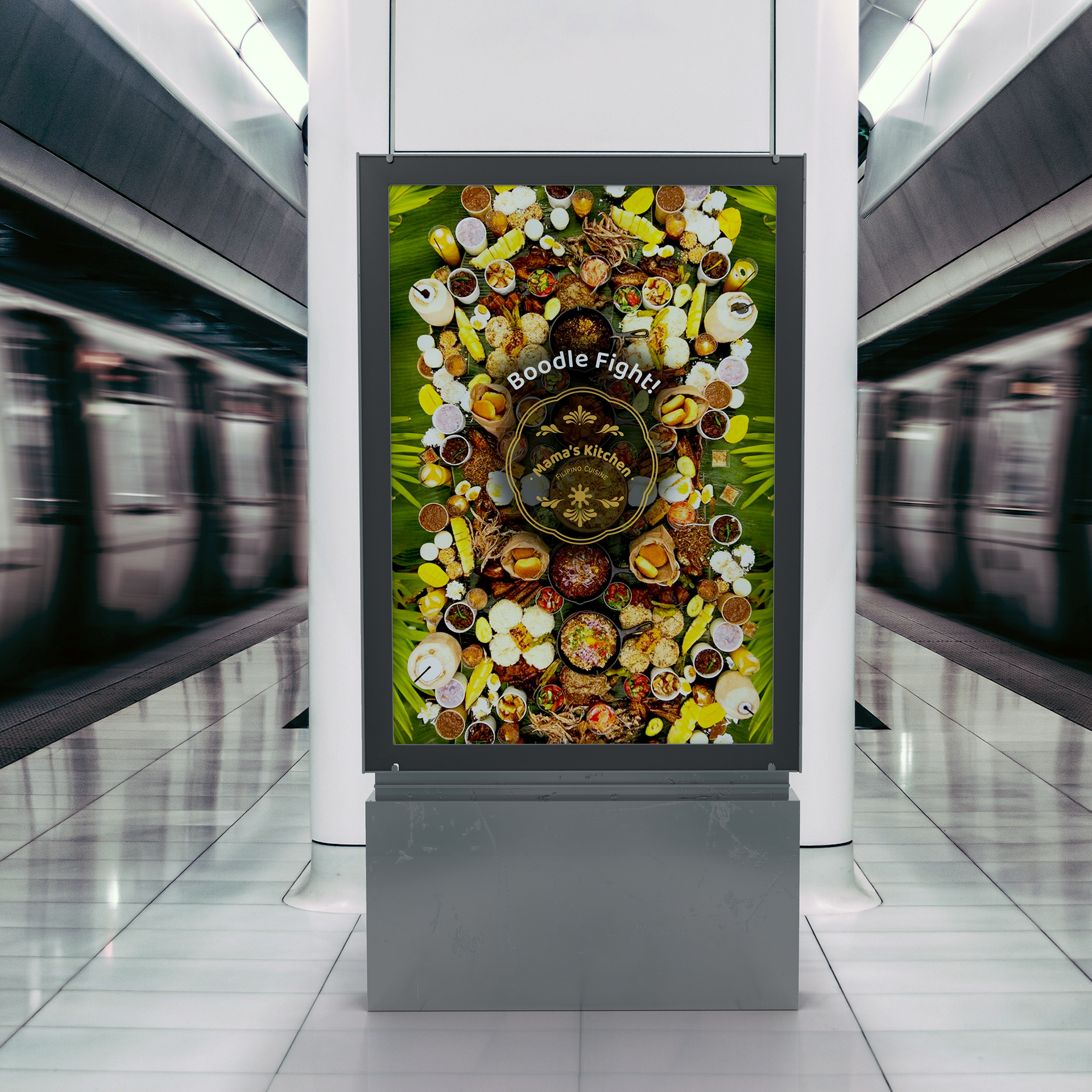
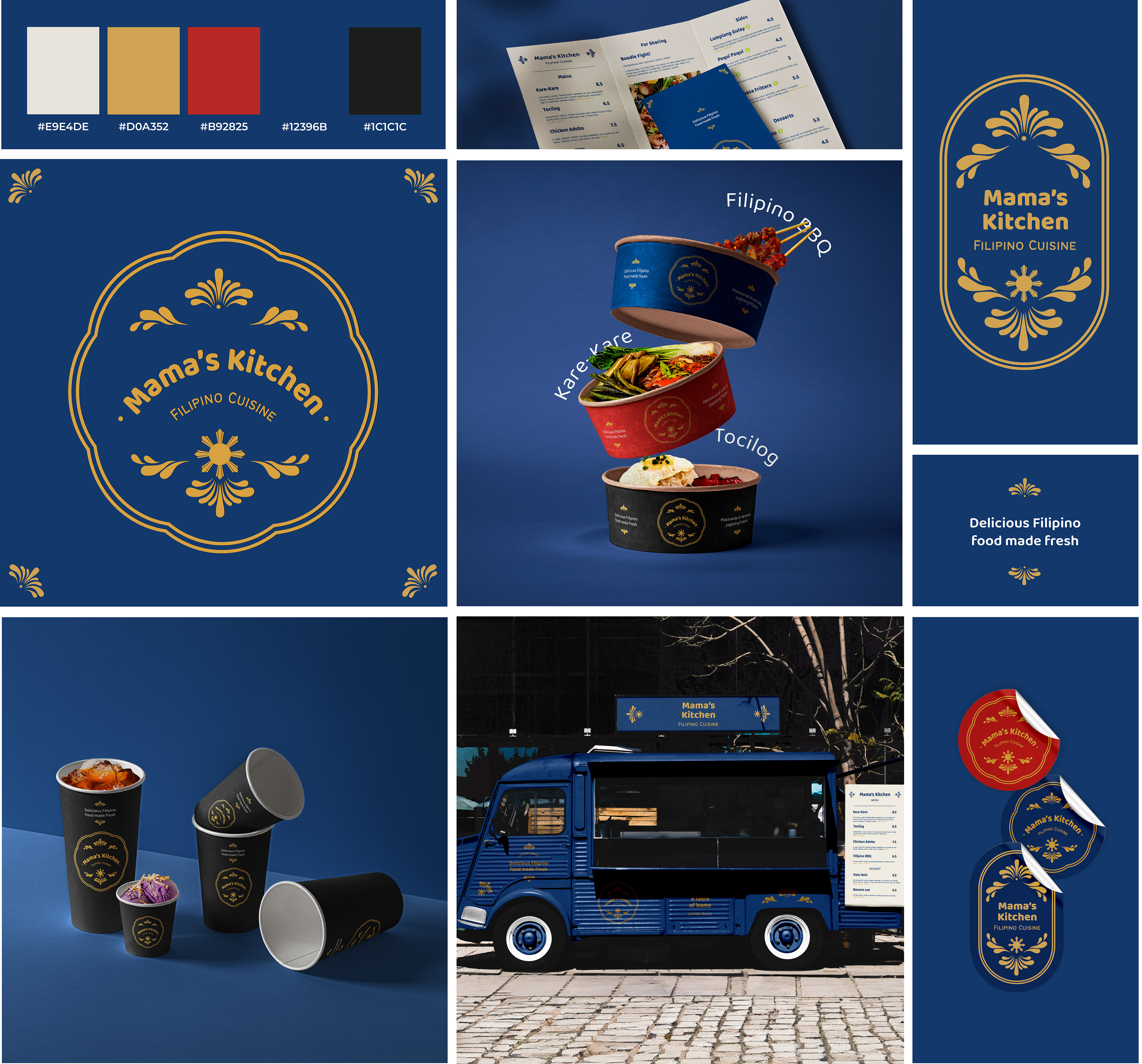
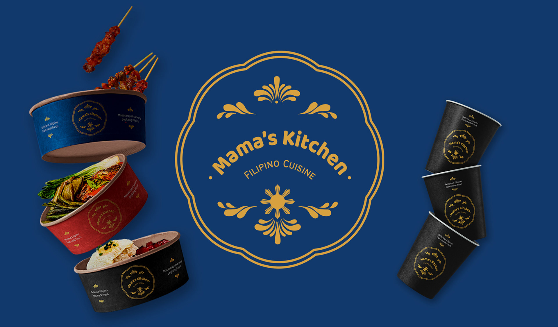
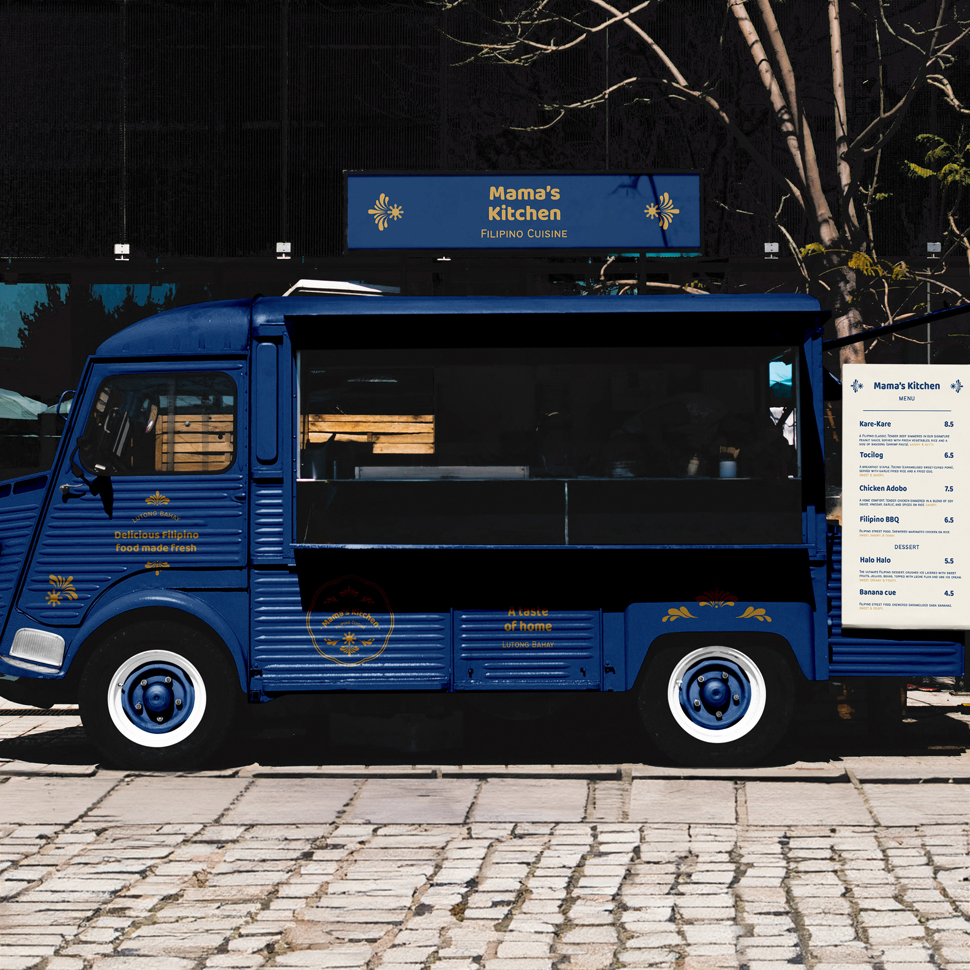
My goal was to create a brand that feels elegant, simple, and welcoming. To achieve this, I took inspiration from the Filipino flag for colours and symbols. The decorative filigree and floral motifs are inspired by traditional tambourine jewellery and piña fabric textile designs.
Red: Symbolising valour and patriotism.
Blue: Signifying peace, truth, and justice.
Yellow: Representing hope and optimism.
White: Purity and peace.
The Sun: A symbol of independence and freedom.
Being half-Filipino, I feel deeply connected to the Philippines and its culture. Food is a powerful medium for preserving and sharing cultural heritage, and in this project, I wanted to celebrate those home comforts.
My goal was to create a brand that feels elegant, simple, and welcoming. To achieve this, I took inspiration from the Filipino flag for colours and symbols. The decorative filigree and floral motifs are inspired by traditional tambourine jewellery and piña fabric textile designs.
Red: Symbolising valour and patriotism.
Blue: Signifying peace, truth, and justice.
Yellow: Representing hope and optimism.
White: Purity and peace.
The Sun: A symbol of independence and freedom.