Mama's Kitchen
‘Introducing Mamas Kitchen! The next best thing to happen! Serving a mouthwatering journey through the vibrant world of South East Asian cuisine!'
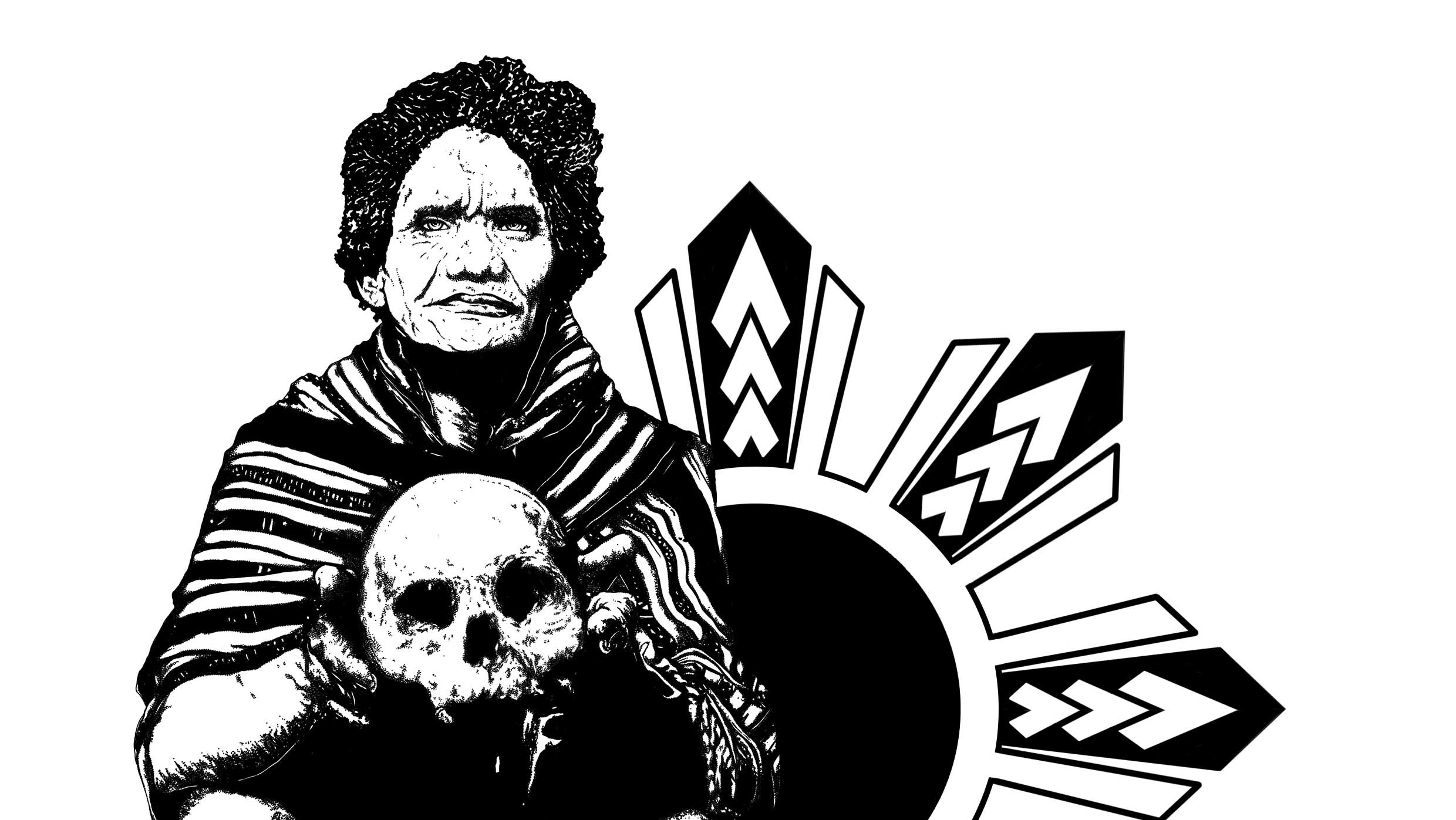
As someone who is half Filipino, I have a profound connection to the Philippines and its rich culture. Food is a powerful medium for preserving and sharing cultural heritage, and in this project, I wanted to celebrate those home comforts.
‘Introducing Mamas Kitchen! The next best thing to happen! Serving a mouthwatering journey through the vibrant world of South East Asian cuisine!'
As someone who is half Filipino, I have a profound connection to the Philippines and its rich culture. Food is a powerful medium for preserving and sharing cultural heritage, and in this project, I wanted to celebrate those home comforts.
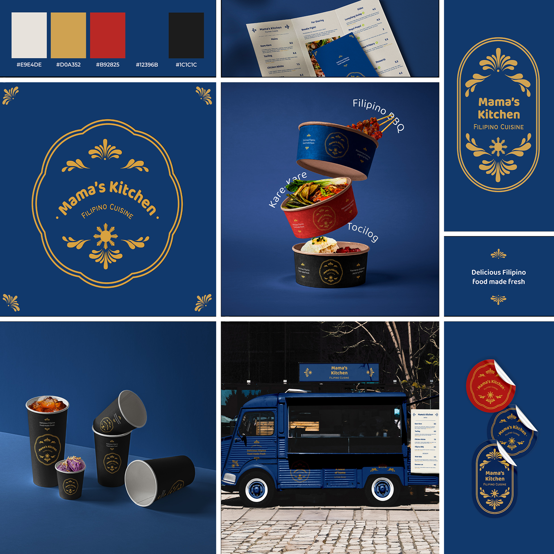
I aimed to imbue the brand with an understated sense of elegance, simplicity, and friendliness. To achieve this, I took inspiration from the Filipino flag for colours and symbols, and used the font Baloo Bhaijaan Regular, paired with Bantayog. The former typeface strikes a balance between clean, legible design with a subtle playfulness.
It mirrors the genuine warmth and hospitality often associated with Filipino culture and complements the straightforward essence of Filipino cuisine, where each ingredient speaks for itself.
It mirrors the genuine warmth and hospitality often associated with Filipino culture and complements the straightforward essence of Filipino cuisine, where each ingredient speaks for itself.
The latter font is a rough, all-caps, sans-serif typeface based on the characters repainted over the worn-out, cast iron text about significant events in the past and the lives of prominent national figures narrated on Philippine historical markers.
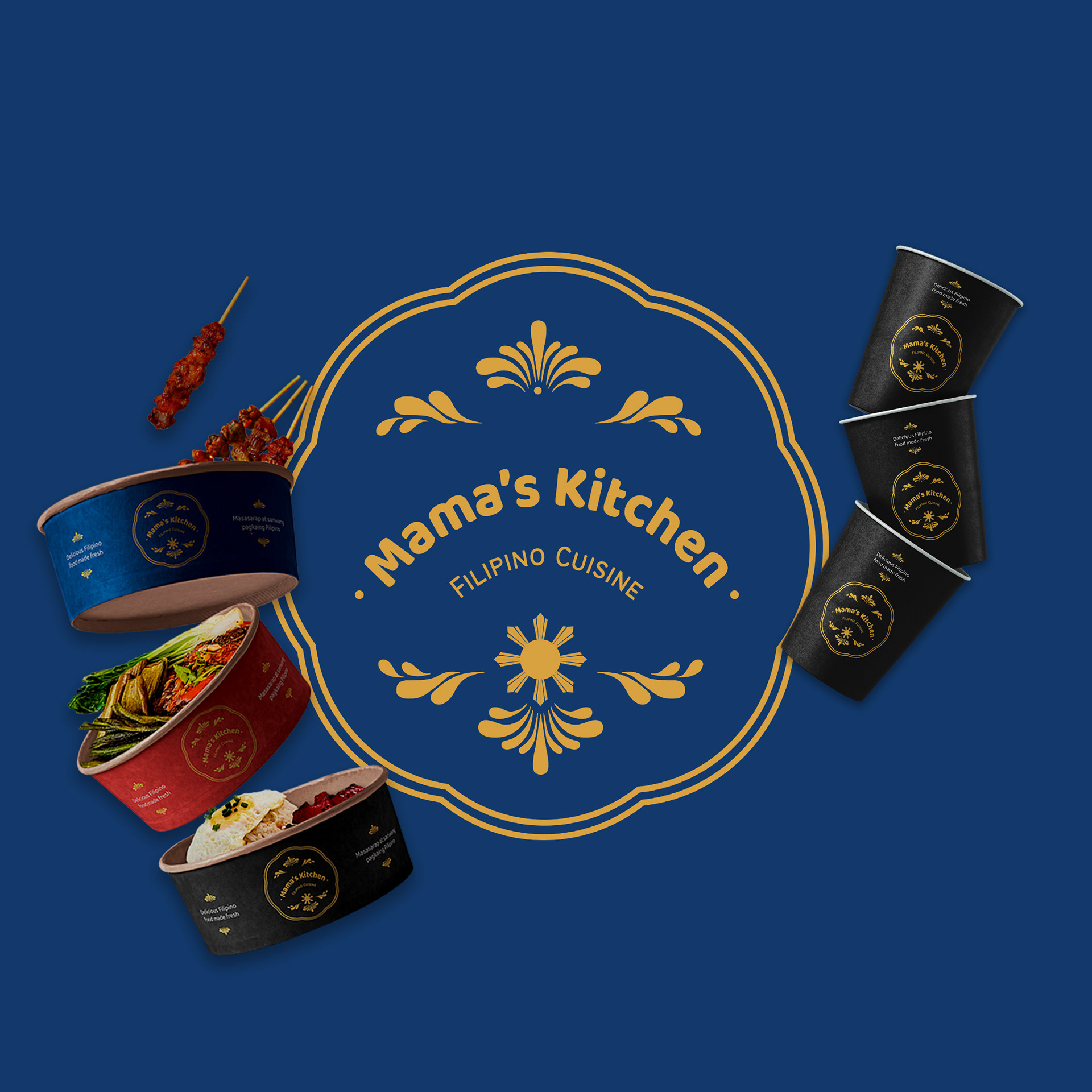
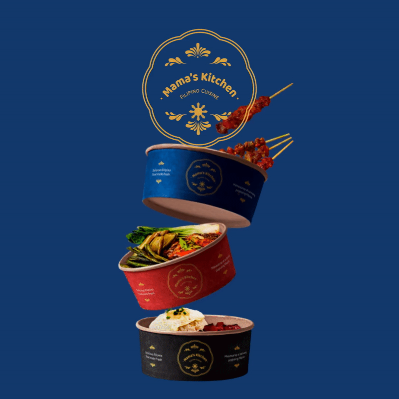
The decorative filigree and flower shape is inspired by traditional tambourine jewellery, and piña fabric textile designs.
Symbolising valour and patriotism.
Blue: Signifying peace, truth, and justice.
Yellow: Representing hope and optimism.
White: Purity and peace.
The Sun: A symbol of independence and freedom.
Primary Logo
Submark Logo
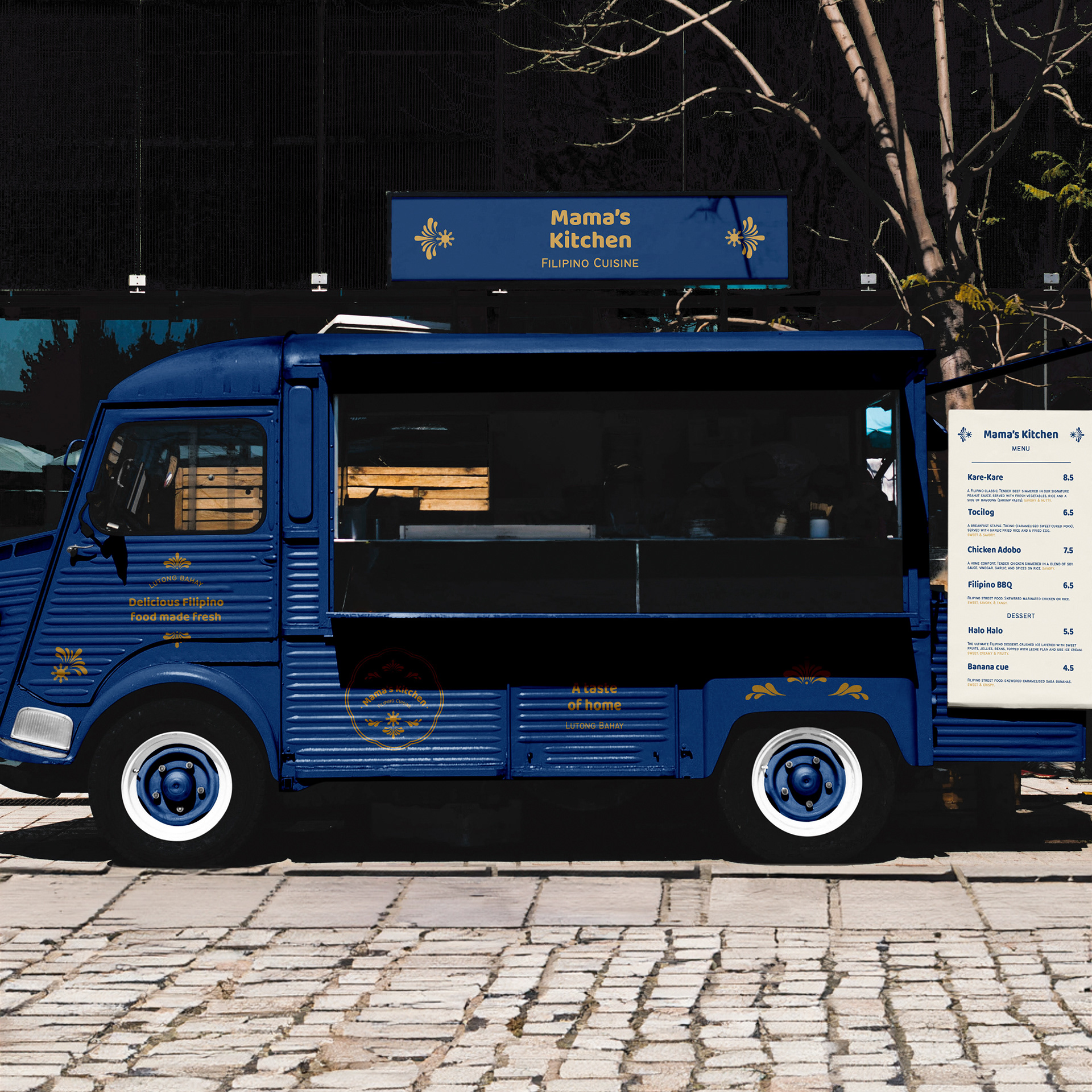
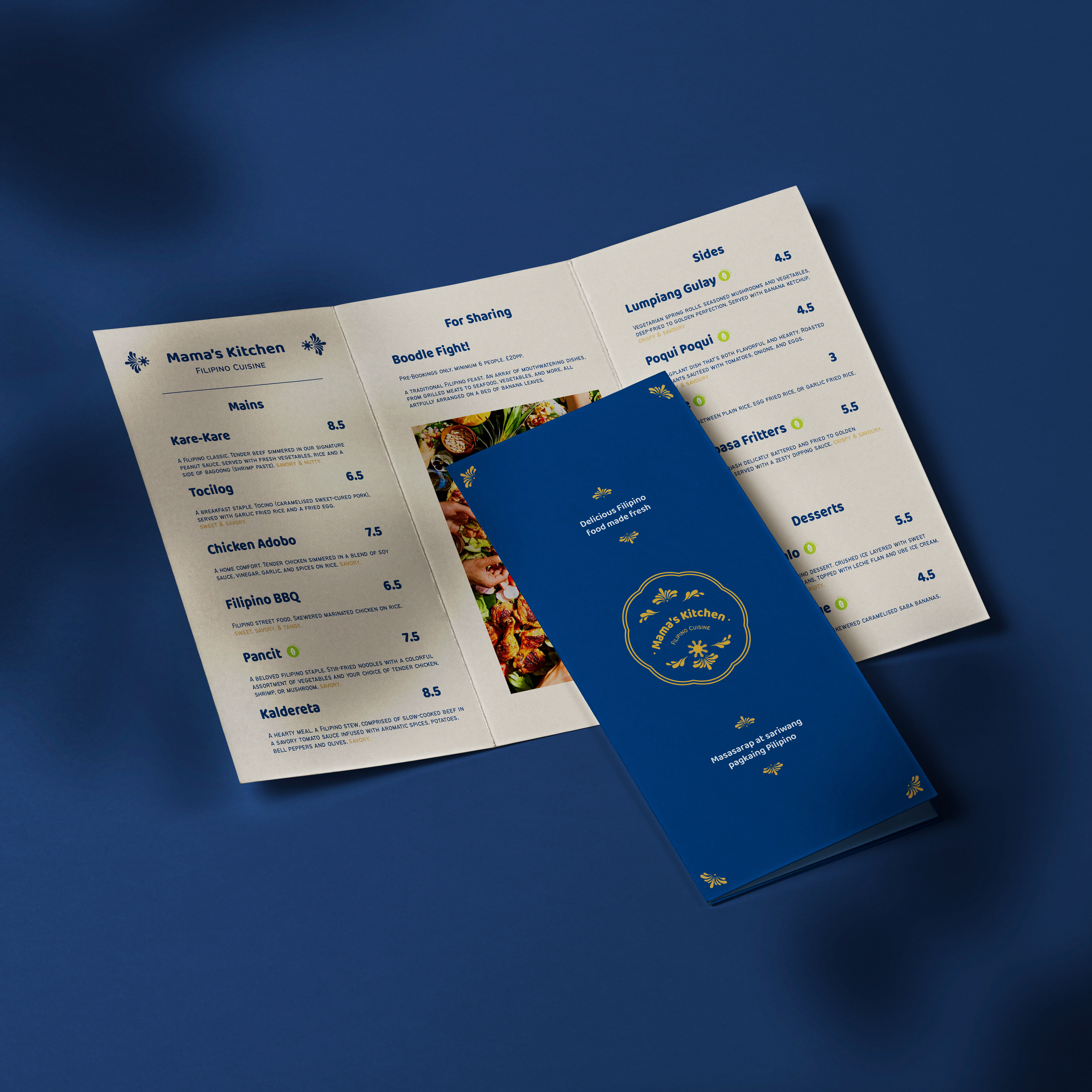
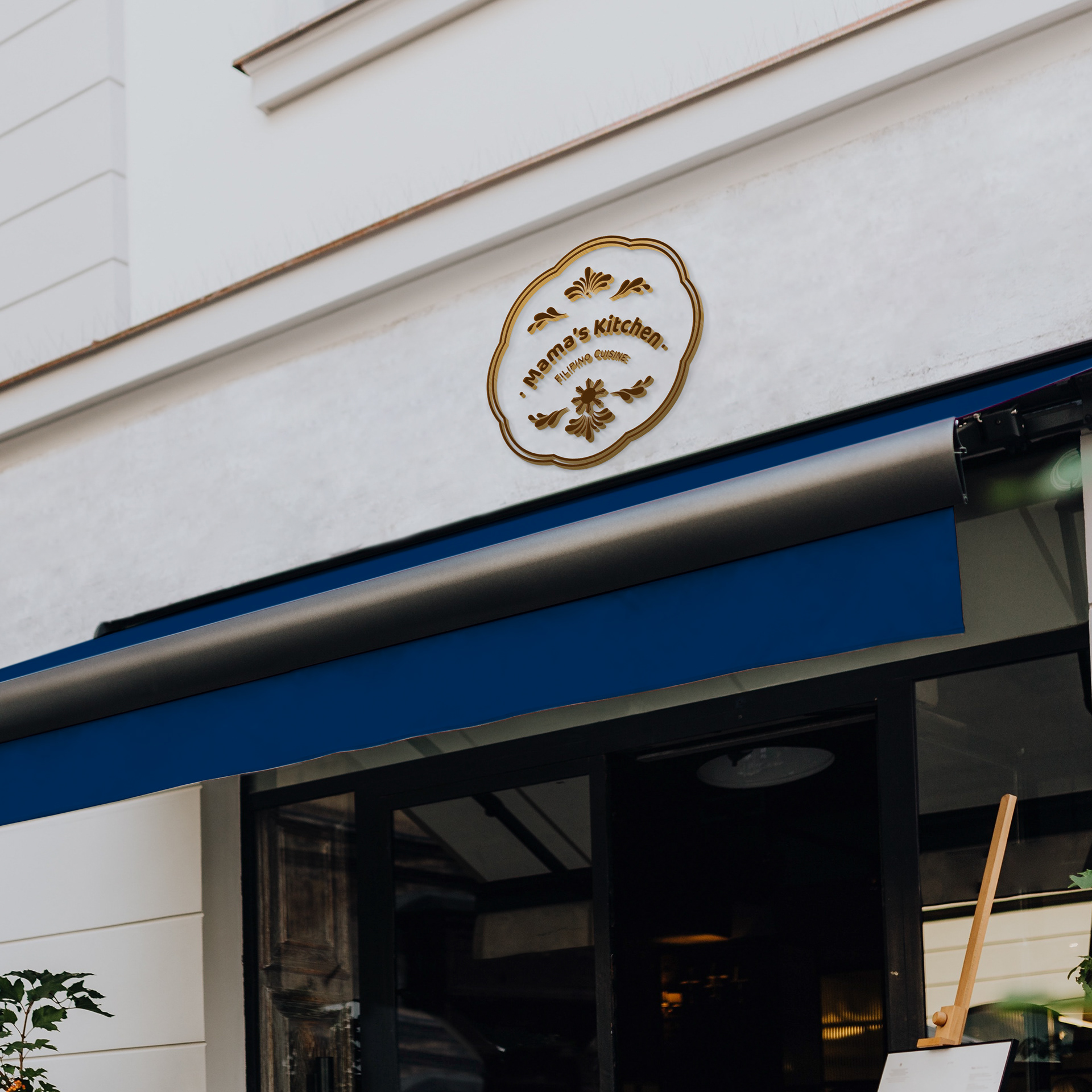
Storefront
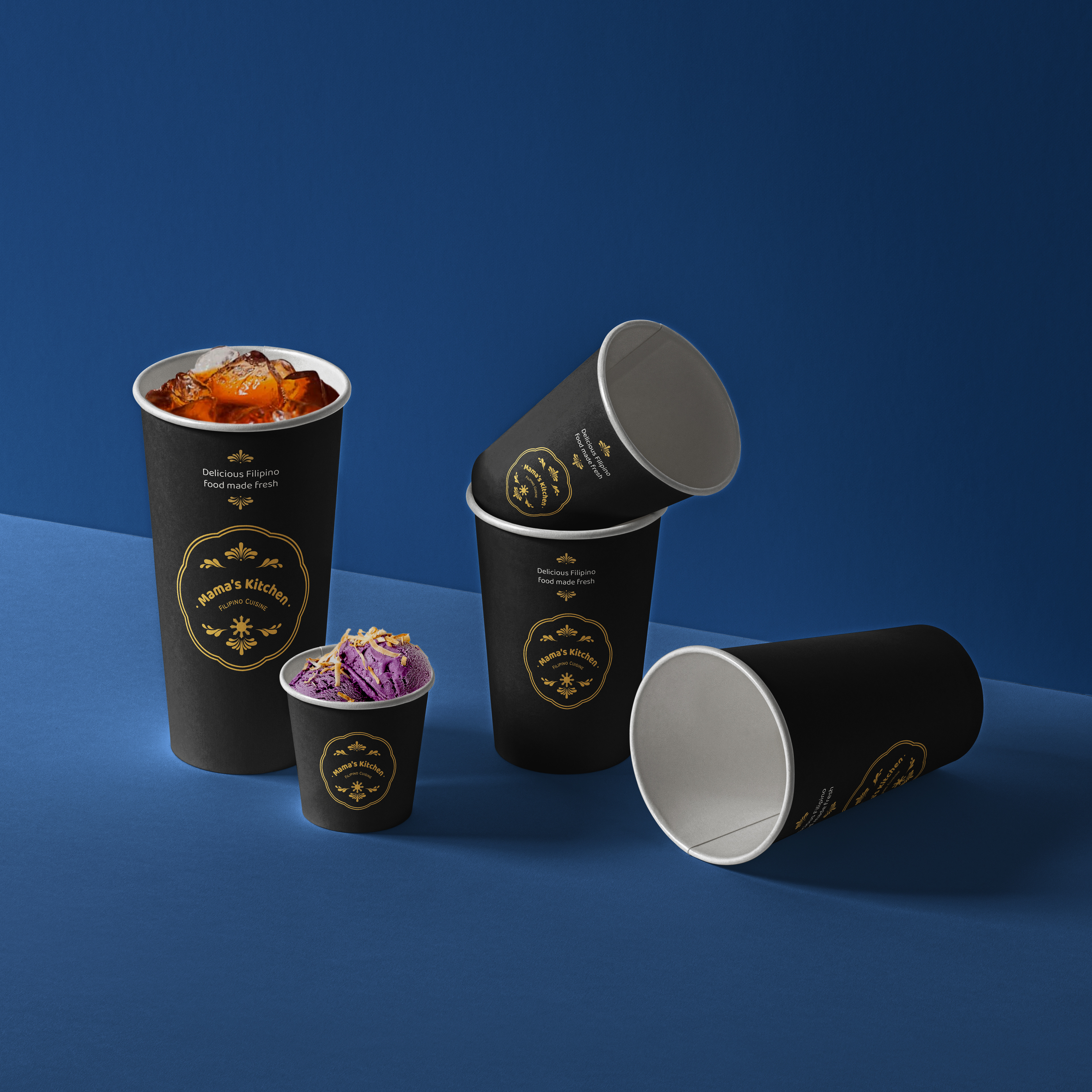
Merchandise/Packaging
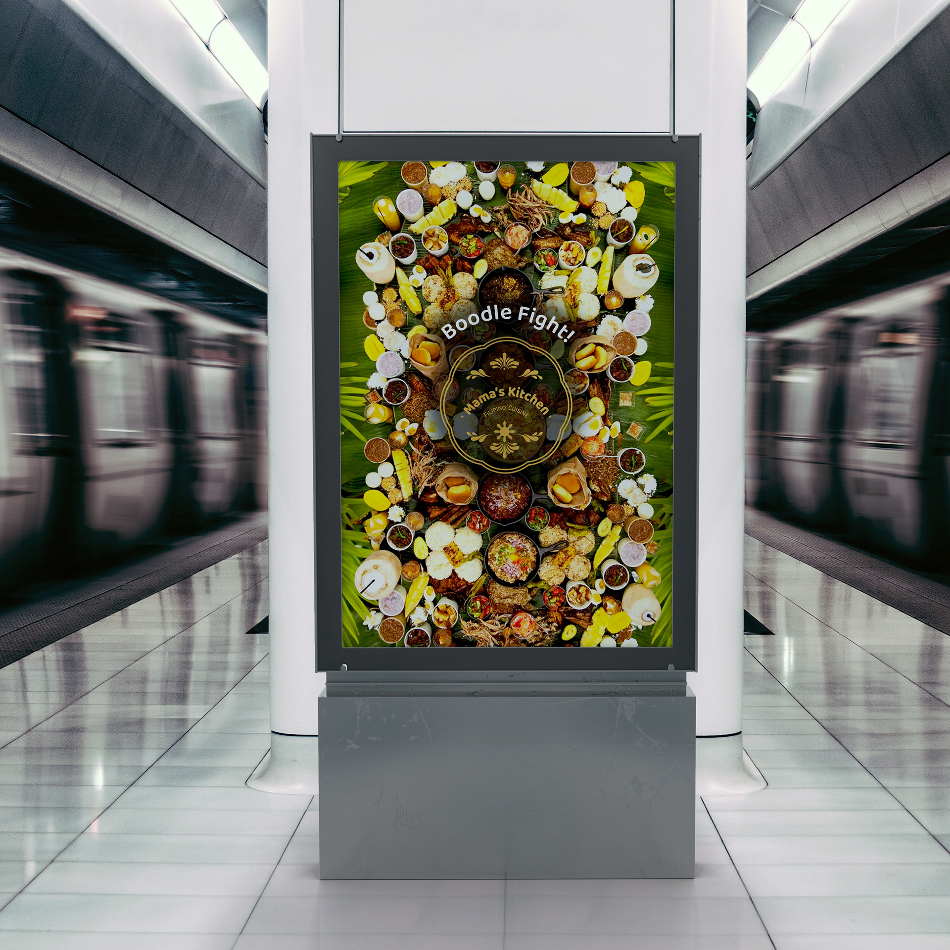
Food Van
Extras
#TheBriefASSOCIATION #TBAMAMAS
Software used: Photoshop, Illustrator, After Effects
The decorative filigree and flower shape is inspired by traditional tambourine jewellery, and piña fabric textile designs.
Symbolising valour and patriotism.
Blue: Signifying peace, truth, and justice.
Yellow: Representing hope and optimism.
White: Purity and peace.
The Sun: A symbol of independence and freedom.
Primary Logo
Submark Logo
Storefront
Merchandise/Packaging
Food Van
Extras
#TheBriefASSOCIATION #TBAMAMAS
Software used: Photoshop, Illustrator, After Effects